When things go south in your software, don’t blame users. Let me tell you a cautionary tale about what that blame does to user experience. I’d gotten an email from a vendor that I already had had a good experience with. They were promoting a new product that looked interesting so I clicked on the link, watched a video, read some marketing stuff and decided to buy it. Pretty good user experience, right? If had one of those satisfaction monitors that some of the reality shows have, you know those dials where you can dial it up to show you’re happy or dial it down to show you don’t like what’s happening. Well, I was well into the good zone.

Everybody knows how to buy something online right? We all have what are called “mental models” of how online shopping works. Mental models are extremely important in UX/UCD, and the idea is that we think we know how something works because we extrapolate from something else. Maybe it’s another online retailer, maybe it’s some instructions we read, maybe it’s what somebody else told us. Anyway, my mental model was that I was going to click somewhere to add this software to my shopping cart, and then there’d be some kind of payment dance, and when I was done, the download would start.
So the software is in my cart, no problem. But there are two buttons for payment: one button was for using PayPal and the other one was for using PayPal to pay with a credit card. And really the last thing online retailers should want is to slow users down by making them think about which payment button to click. What if the effort of having to think about which button to click slows me down just enough to interrupt my purchase?
But I clicked the second one and went through checkout. It was one of those sites where when you purchase something new it appears in your account for downloading. But nothing new showed up in my account. That glow is dimming some more.
So I figured I’d done something wrong (now I feel stupid AND not as happy as I was five minutes ago). But I still wanted the software so I went through the checkout process again, this time successfully. (Light’s shining a little brighter now). All was well until I checked my email and got two notices from the vendor and two notices from my charge card company. What do you think that did to my software therapy afterglow?

But the vendor provides good UX because my account page has a contact us button on it, so I explain the issue in an email and trust them to handle the problem. I figure it’s just a matter of them sending me a refund, and then we’re all on our way.
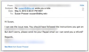
Now I’m sure the customer support person didn’t make the confusing buttons on the company’s website. But she still provided some pretty poor UX in her email to me: “I see the issue now. You should have followed instructions….”
Blaming users when the software goes wrong only compounds the problem. I design software for a living. I figure that I know how developers think and that I can work my way through most systems. But their ambiguous button naming was the problem. And then they blamed the me for getting confused.
You can have great software and then completely ruin a user’s buzz with blame-y customer support. But here’s the truth—if the user gets confused in my software, it’s my fault for not creating it the right way. I’ve got to put on my big developer pants and figure out how to keep them from getting confused. That might mean better button names, better feedback, or a completely different process. If I’m in regular contact with the users during development, they’re going to tell me what doesn’t work early in the process so that I can fix without a big impact on the schedule and budget.